Effective Church Communications

The Effective Church Communication ministry from Yvon Prehn provides inspiration, training, and resources to help your church create communications that fully fulfill the Great Commission. It focuses on Bible-based and timeless principles and strategies that work no matter what digital or print channel you use to create your communications. The site has links to many free TEMPLATES and other resources, plus links to free TRAINING VIDEOS, and a RESOURCE LIBRARY for church communicators. 

The Effective Church Communication ministry from Yvon Prehn provides inspiration, training, and resources to help your church create communications that fully fulfill the Great Commission. It focuses on Bible-based and timeless principles and strategies that work no matter what digital or print channel you use to create your communications. The site has links to many free TEMPLATES and other resources, plus links to free TRAINING VIDEOS, and a RESOURCE LIBRARY for church communicators.
  • Home
  • ABOUT
  • BLOG
  • PODCAST
  • FREE PRINT TEMPLATES

Free Islamic-looking (English letters) font for Ramadan publications or other times it might be appropriate

24 April, 2020 By Yvon Prehn Leave a Comment

Ramadan alone--share a kind note
I don't know the challenges of celebrating Ramadan alone, but we can acknowledge that we care to our Muslim friends.

Current note April 2020: it is currently the time of Ramadan for our Muslim neighbors and it is an especially challenging time because of the intensely social nature of Ramadan and the current restrictions because of the social distancing requirements many are wanting to follow. A kind note to a Muslim friend might be appropriate. I recently received an email from a Muslim friend and though I honestly didn't know what to say, I wanted them to know that I was acknowledging the challenges they were facing—it was meant as a gentle virtual hug and I hope accepted that way.

You don't have to use the fonts below to write the note, but in case you want to use them at some time for a related topic, this seemed like a good time to share this again.

Past post:

Whether it is for the month of Ramadan or any time that you want to create communications about the Muslim religion, a font that has an Islamic look while still using English letters, is useful. Below is a very short video that shows the website for a variety of useful Islamic looking fonts and below it is the link to the site.

Here is the link to the fonts:

Islamic looking fonts--for free downloads of fonts:
http://www.dafont.com/theme.php?cat=202

Do check out the site for other fonts that look interesting--there are a lot of them.

Video of how to download them:


Islamic looking fonts--for free downloads of fonts:
http://www.dafont.com/theme.php?cat=202


Share this:

  • Email
  • Tweet
  • WhatsApp
  • Pocket
  • Share on Tumblr

Filed Under: Islamic, Typography Tagged With: Free font, free font for Ramadan, free Islamic font

Typesetting for kid’s communications

24 August, 2016 By Yvon Prehn 2 Comments

PDF of Typesetting for Kids publicationsCreating communications for children can be lots of fun, especially with the fun typefaces you can use.

This PDF gives you some guidelines to make your use of them more effective. Though it has some useful tips, the companies cited are no longer in business, but http://www.fontspace.com/ is and below are some of their current fonts that are great for children:

All the fonts above are from:  http://www.fontspace.com/ and are free downloads.

Google fonts also has a great selection of free fonts

One very important guideline to keep in mind is to NEVER use the typefaces that have reversed letters (such as a reversed "e" or "s"). It might seem like that would be a harmless, cute thing to do, but when little children receive a printed piece from a respected person in the church and the penmanship is all wrong, it can be confusing.

Have fun, do kid-friendly things, but always remember the position of authority and influence you have in young lives.

To download the PDF, click here or on the image.

note: this PDF is from Yvon Prehn's archives and is the only format of this article available presently. Not the greatest quality to be sure, but shared with the belief that the content is useful.

Share this:

  • Email
  • Tweet
  • WhatsApp
  • Pocket
  • Share on Tumblr

Filed Under: Children's ministry, Typography Tagged With: Children's ministry, Communications, type-setting, typeface choice, yvon prehn

It’s not about your creativity, it’s about serving your congregation with your church bulletin

2 December, 2013 By Yvon Prehn 5 Comments

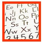
Letters need to be organized to communicate.
Letters don't mean anything until your organize them into clear, consistent communications.

Though the church communicator emailing me was asking about another topic, in passing she mentioned that she was going to be taking over the production of the church bulletin and was looking forward to changing it every week so she could express her creativity through it.

Her excitement about the new project and a wish to be creative was commendable, but it isn't a good idea to change the format of the church bulletin (or any other church communication) on a weekly or any other frequent basis and here's why:

People don't read the bulletin because they are looking for creative inspiration, they read it for information.

People access information by means of the structure you give them in your communications. The structure of your bulletin consists of the layout, the type and illustrations that you use, plus how you organize material into sections.

You want to come up with a clear system of how you use these structural tools so that people will not be conscious of the building blocks of your system, but will be able to easily access the information.

Type is one of the most important building blocks. On your church newsletter or bulletin, if someone says, "that was an interesting typeface," it isn't a compliment.

Did you notice the typeface on any blog you read regularly, on Facebook, or your local newspaper? You don't because you should always see through the typeface to the content. If people notice the typeface it can be a distraction to your message. [Read more...]

Share this:

  • Email
  • Tweet
  • WhatsApp
  • Pocket
  • Share on Tumblr

Filed Under: Church Bulletins, Church Newsletters, Typography Tagged With: church bulletin tips, church bulletin typography, church bulletins, consistency in church communications, typography in church communications

Video and notes: Tips for using COLOR in text

30 September, 2012 By Yvon Prehn Leave a Comment

Video: Tips for using COLOR in text
This video will help you make sure that your colored text not only looks good but is readable.

We might like how a color looks in an illustration, but the same color that might make a design appealing, might also make the message unreadable if we use that color in text. This short video will give you tips on how to use color in the text of your communications. The text is the most important part of any communication because that is the primary carrier of your message. It doesn't matter how pretty or inspiring an illustration is if people don't come to the event or learn what you want them to. [Read more...]

Share this:

  • Email
  • Tweet
  • WhatsApp
  • Pocket
  • Share on Tumblr

Filed Under: Design, Typography Tagged With: church communication typography, color choice in text, type color, typography choices

Linotype, the Film…..or how typesetting was done before computers

27 July, 2012 By Yvon Prehn 4 Comments

Typography is a topic of almost endless fascination to many of us who love words and work hard to craft our messages. Though our message is unchanging, during my lifetime the methods for communicating this message have changed dramatically. One part of the history of type has recently been made into a movie and one of the ECC readers sent me this fantastic movie trailer about Linotype machines, which were extraordinary for their time in how they were able to cast an entire line of type rather than a typesetter having to assemble them letter by letter.

Take a minute to enjoy it. The brief material and link below the movie tell you more about it.

More about the film from the website:

Linotype: The Film is a feature-length documentary centered around the Linotype type casting machine. Called the "Eighth Wonder of the World" by Thomas Edison, it revolutionized printing and society. The film tells the charming and emotional story of the people connected to the Linotype and how it impacted the world.
The Linotype (pronounced "line-o-type") completely transformed the communication of information similarly to how the internet is now changing communication again.

Although these machines were revolutionary, technology began to supersede the Linotype and they were scrapped and melted-down by the thousands. Today, very few machines are still in existence.

The highly-skilled operators of the Linotype are in a battle against time. If their skills are not passed along to a new generation of operators, the machine will die completely. There is a small group of former operators that want to save the Linotype from the scrap yard, but some see this as a fruitless endeavor.

What place does the Linotype have in the age of new technology? Should the machine be shoved into a museum and left to rust? Why should anyone care about typography or the technology of communication? The film seeks to answer these questions.

For more about the film, go to: http://www.linotypefilm.com/

Share this:

  • Email
  • Tweet
  • WhatsApp
  • Pocket
  • Share on Tumblr

Filed Under: Typography Tagged With: history of type, linotype movie, movie about type, Typography

  • 1
  • 2
  • 3
  • Next Page »
Free Graduation Templates

Recent Posts

  • Graduates Resources, video preview, new and updated
  • For Graduates: Celebrate but also challenge
  • ECC PODCAST: Father’s Day—Beyond celebration—how to make the ministry most of it to grow Dads spiritually
  • A challenge for Graduates—choose your North Star wisely
  • A Prayer for Graduates, Free flyer, bulletin insert
Free Fathers Day Templates

Most read posts

  • Great information kiosk—wish more churches had one like it!
  • Six Steps to Simple filing
  • PDF form: Church Communication Survey
  • Bulletin inserts or social media content for Father's Day; poetry, challenges, encouragements
  • Father's Day and Men's Ministry Templates
  • FREE PRINT TEMPLATES
  • Graduation Templates

Seasonal Templates

  • OVERVIEW of TEMPLATES for Church Communicators, please read first
  • Valentine’s Day Templates
  • Lenten Templates
  • Easter Templates
  • Mother’s Day Templates
  • Father’s Day and Men’s Ministry Templates
  • Graduation Templates
  • Summer-related Templates
  • 4th of July, Canada Day, and GRACE for All Nations
  • See You At the Pole
  • Harvest Festival and Halloween Templates
  • Christmas Templates

Misc. Church Communications Templates

  • Church Connection Cards
  • Business/Invitation Card Templates
  • Back to Church for Kids in the Fall Templates
  • Church Bulletin Template
  • Volunteer and Encouragement Templates
  • 2-page Senior Adult Print Newsletter Template
  • Misc. Church Templates
  • Home
  • ABOUT
  • BLOG
  • PODCAST
  • FREE PRINT TEMPLATES

Copyright © 2022 · Enterprise Pro Theme On Genesis Framework · WordPress · Log in

loading Cancel
Post was not sent - check your email addresses!
Email check failed, please try again
Sorry, your blog cannot share posts by email.